The UX/UI design of Musee d’art 60, an app and responsive website, focuses on providing a seamless and enjoyable experience for users who want to plan their museum visits, engage with audio storytelling, and purchase tickets conveniently.
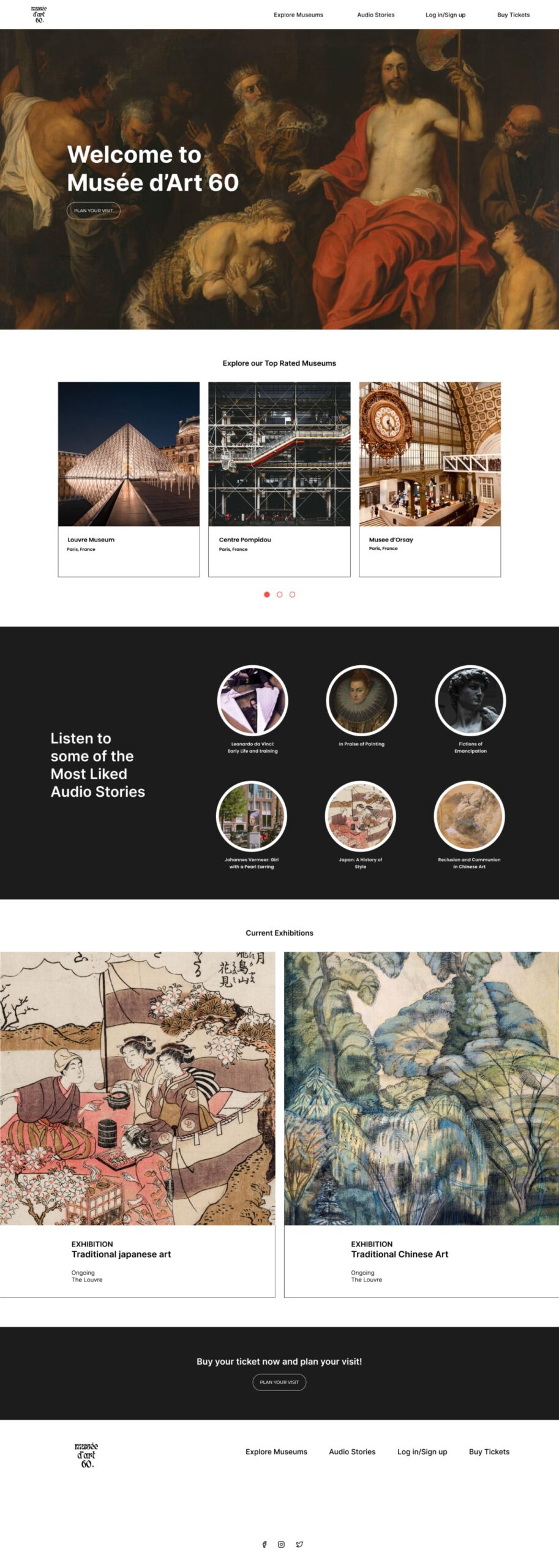

Visually appealing header, featuring a clean and modern design language that reflects contemporary design trends.

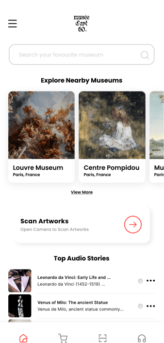
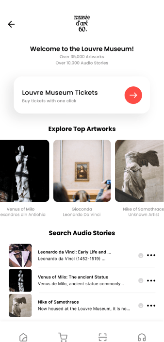
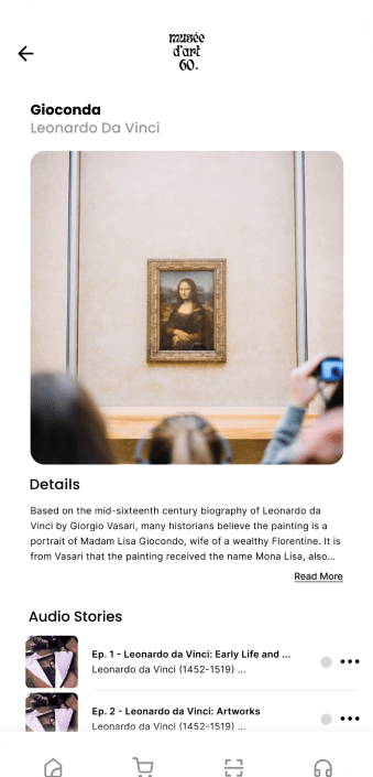
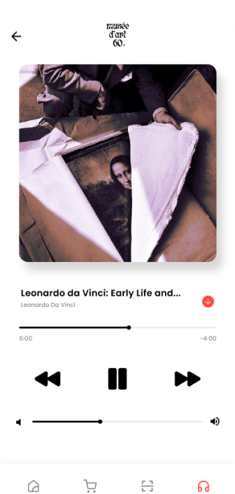
Audio storytelling is a key feature of Musee d’Art 60, and the UI design emphasizes easy access to this content. Users can easily browse and listen to curated audio tours that provide insightful narratives about specific artworks or themes.

The typography is legible, ensuring clear communication of information and enhancing user readability.
The app and website utilize a clean and modern design aesthetic that showcases the museums and captures the essence of the museum’s brand identity.

The app and website offer intuitive navigation, allowing users to easily explore different exhibits.

on creating a seamless and delightful user experience that enhances the museum visit and audio storytelling process. By combining a user-centered approach with a visually appealing and modern design language, the UX/UI designer can create a successful Musée d’Art 60 app that offers a seamless and immersive museum visit experience for users.

As a UX/UI designer working on Musée d’Art 60, my focus would be
on creating a seamless and delightful user experience that enhances the museum visit and audio storytelling process. By combining a user-centered approach with a visually appealing and modern design language, the UX/UI designer can create a successful Musée d’Art 60 app that offers a seamless and immersive museum visit experience for users.
THE PRODUCT: Musée d’Art 60 it’s an app that provides quick audio stories after scanning the QR code with your personal phone for each artwork.
THE PROBLEM: How to easily find short audio stories and description for artworks?
THE GOAL: Listen to short audio stories and descriptions for each artwork scanned.
MY ROLE: Generalist Designer
RESPONSABILITIES: User research, Wireframing, Prototyping, Visual Design
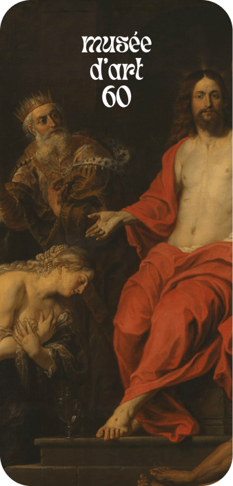

Colors play a significant role in UX/UI design and can evoke different emotions, set a particular mood, and communicate information effectively.
(01) FFFFFF: The use of white signifies purity, simplicity, and elegance. It provides a clean and minimalist backdrop, allowing the artworks and content to take center stage. White also evokes a sense of openness and tranquility, enhancing the overall visual experience and reflecting the museum’s commitment to showcasing art in a pristine environment.
(02) FD4C45: The bright red color serves as an eye-catching accent within the Musée d’art 60’s color palette. It adds energy, passion, and excitement to the design, grabbing attention and creating a focal point. This vibrant red hue can be strategically employed to highlight important elements such as buttons, call-to-action prompts, or key information, drawing users’ focus and encouraging interaction.
(03) 000000: Black is often associated with sophistication, elegance, and timelessness. In the context of Musee d’art 60, black serves as a grounding color that adds depth and contrast to the overall design. It provides a sense of stability and allows other colors and visual elements to stand out.
(01) FFFFFF
(02) FD4C45
(03) 000000
Typography in UX/UI design is a powerful tool for enhancing
readability, establishing hierarchy, conveying brand identity, setting the tone and mood, promoting accessibility, and maintaining visual consistency. It plays a significant role in creating a positive user experience and facilitating effective communication between the product and its users.
Poppins is a versatile and elegant sans-serif font that offers excellent readability in various sizes. Its rounded edges and balanced proportions give it a friendly and approachable appearance. Poppins is used for body text, menus, and other longer passages of content in the Musée d’art 60 interface. This font choice ensures clear and legible text, enhancing the overall user experience and facilitating smooth reading.
Oswald is a bold and distinctive font that exudes a sense of strength and modernity. Its clean lines and geometric shapes give it a contemporary feel, making it well-suited for headlines, titles, and prominent text elements within the Musee d’art 60 interface. Oswald’s strong presence adds visual impact and helps create a memorable impression.
The combination of Oswald and Poppins in the typography of Musée d’art 60 creates a complementary visual hierarchy. Oswald’s boldness and uniqueness draw attention to important headings and titles, while Poppins provides clarity and readability for longer texts. This combination strikes a balance between modernity and approachability, aligning with the museum’s brand identity and enhancing the overall aesthetic appeal of the interface.
CTA buttons serve as a vital tool for guiding users and driving conversions on a website. By ensuring clarity, visual contrast, proper sizing and placement, responsiveness, engaging design, and continuous optimization, CTA buttons can effectively encourage users to take desired actions and contribute to the success of a website’s goals.
Normal State: The normal state represents the default appearance of a button when it is not being interacted with. It typically has a base color, text, and any relevant icons or imagery. The normal state sets the initial visual impression of the button and should be designed to catch the user’s attention.
Hover State: The hover state is activated when a user hovers their cursor over the button. It provides visual feedback to indicate that the button is interactive and ready for interaction. This state often includes changes in color, such as a subtle color shift or highlighting effect, to give the user a visual cue that the button can be clicked.
Pushed State: The pushed state is activated when a user clicks or taps the button, visually indicating that the button has been activated or pressed. This state typically shows a visual change, such as a slight shadow or change in background color, to provide feedback that the button is being actively pressed.
Iconography in UX/UI refers to the use of visual symbols or icons to quickly and effectively communicate actions, concepts, or objects within a user interface. It enhances usability, promotes consistency, saves space, contributes to branding, and requires consideration for accessibility.
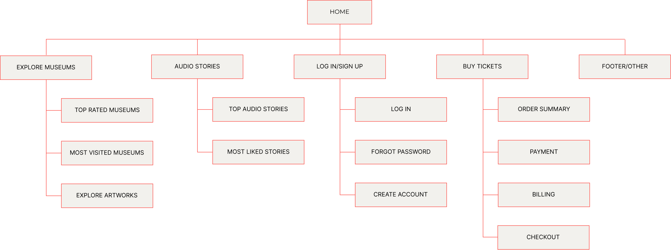
In UX/UI design, a visual sitemap is a graphical representation
or diagram that illustrates the structure and hierarchy of a website’s pages, typically displayed in a hierarchical tree-like format. It helps designers and stakeholders visualize the organization and relationships between different pages or sections of a website.
© 2023 Teodora Perieteanu. All Rights Reserved.