The UX/UI process for “ENRGIA,” an e-commerce website for healthy supplements for women, involves user research, defining goals and user flows, creating wireframes and visual design, prototyping, user testing, development and implementation, iteration and optimization, and ongoing maintenance.


The header is visually appealing, employing a clean and modern design language that aligns with contemporary design trends.

The black call-to-action buttons in the ENRGIA interface are designed to create a strong visual impact and drive user engagement.

The typography is legible, ensuring clear communication of information and enhancing user readability.
The color scheme is carefully chosen to reflect the brand’s personality and evoke a sense of calm and quality.

The clean footer design for ENRGIA focuses on providing a visually uncluttered and organized layout while offering important information and functionality to users.

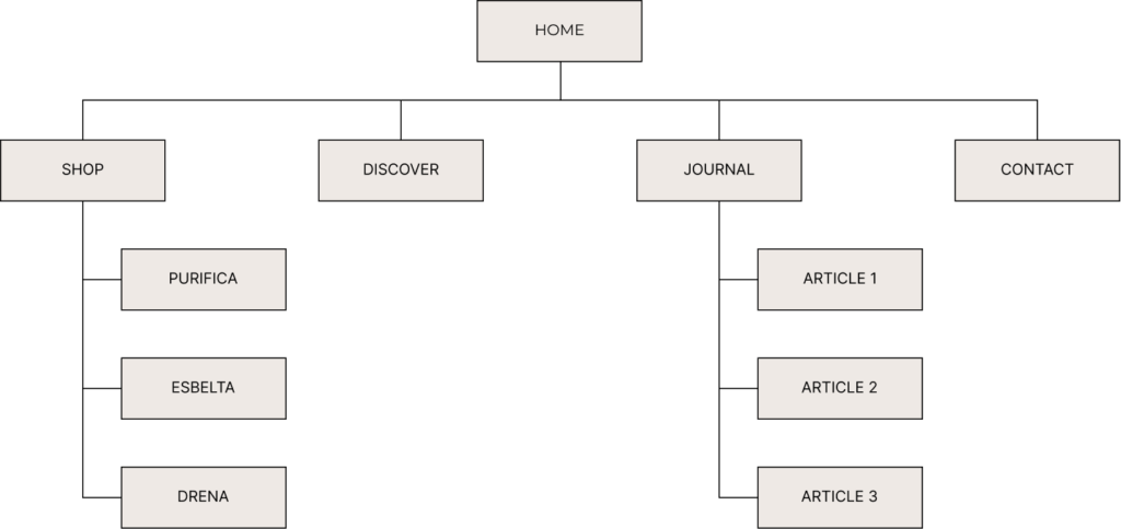
In UX/UI design, a visual sitemap is a graphical representation
or diagram that illustrates the structure and hierarchy of a website’s pages, typically displayed in a hierarchical tree-like format. It helps designers and stakeholders visualize the organization and relationships between different pages or sections of a website.

Colors play a significant role in UX/UI design and can evoke different emotions, set a particular mood, and communicate information effectively.
(01) FFFFFF: White is often associated with cleanliness and purity. It creates a sense of hygiene, freshness, and clarity. In the context of nutricosmetics and supplements, it can convey the idea of providing clean and pure products that promote health and well-being.
(02) EEE9E5: The light grayish-beige color can convey a sense of neutrality, balance, and calmness. It provides a neutral backdrop that allows other colors or elements to stand out without overwhelming the viewer.
(03) 000000: Black provides a strong contrast when combined with lighter colors. As an accent color, it can be used to draw attention to specific elements such call-to-action buttons or important informations. It helps create visual emphasis and guide users’ attention to key areas of the website.
(01) FFFFFF
(02) EEE9E5
(03) 000000
Typography in UX/UI design is a powerful tool for enhancing
readability, establishing hierarchy, conveying brand identity, setting the tone and mood, promoting accessibility, and maintaining visual consistency. It plays a significant role in creating a positive user experience and facilitating effective communication between the product and its users.
This typeface has the potential to bring a touch of luxury and exclusivity to the website, reinforcing the idea that the showcased nutricosmetic and supplement products are of premium quality. It can enhance the overall visual appeal and contribute to a memorable and distinctive brand experience.
When combined with appropriate font pairings, such as a contrasting sans-serif font for body text or subheadings, Canela Thin can create a harmonious and balanced typographic hierarchy. This combination can establish a clear visual hierarchy and guide users’ attention to important information and calls to action.
Raleway is a modern and clean sans-serif typeface that offers a sleek and contemporary aesthetic. Its well-designed letterforms and balanced proportions make it highly legible and suitable for various digital platforms.
In terms of readability, Raleway excels, especially in smaller font sizes. Its open letterforms and generous spacing contribute to clear and easy-to-read text, ensuring that visitors can consume the website’s content effortlessly.
CTA buttons serve as a vital tool for guiding users and driving conversions on a website. By ensuring clarity, visual contrast, proper sizing and placement, responsiveness, engaging design, and continuous optimization, CTA buttons can effectively encourage users to take desired actions and contribute to the success of a website’s goals.
Normal State: The normal state represents the default appearance of a button when it is not being interacted with. It typically has a base color, text, and any relevant icons or imagery. The normal state sets the initial visual impression of the button and should be designed to catch the user’s attention.
Hover State: The hover state is activated when a user hovers their cursor over the button. It provides visual feedback to indicate that the button is interactive and ready for interaction. This state often includes changes in color, such as a subtle color shift or highlighting effect, to give the user a visual cue that the button can be clicked.
Pushed State: The pushed state is activated when a user clicks or taps the button, visually indicating that the button has been activated or pressed. This state typically shows a visual change, such as a slight shadow or change in background color, to provide feedback that the button is being actively pressed.
© 2023 Teodora Perieteanu. All Rights Reserved.