The UX/UI process behind the brand “Patmiré” revolves around creating a seamless and enjoyable shopping experience specifically designed for the young confident woman. As a brand created by a woman for women, Patmiré focuses on understanding and catering to the unique needs and preferences of its target audience.


Visually appealing header, featuring a clean and modern design language that reflects contemporary design trends.

Patmire focuses on personalization to make each shopping experience unique for every customer. By offering tailored product recommendations based on individual preferences and past purchases, the brand establishes a strong connection with its audience.

The typography is legible, ensuring clear communication of information and enhancing user readability.
The website’s navigation is designed to be intuitive and easy to use. It enables users to seamlessly browse different categories, access product details, and explore curated collections, enhancing the overall user experience.

Patmire focuses on personalization to make each shopping experience unique for every customer. By offering tailored product recommendations based on individual preferences and past purchases, the brand establishes a strong connection with its audience.

Colors play a significant role in UX/UI design and can evoke different emotions, set a particular mood, and communicate information effectively.
(01) FFFFFF: White represents purity, simplicity, and elegance. It serves as the base color, providing a clean and minimalist backdrop for the brand. White exudes a sense of sophistication and aligns with the brand’s focus on empowering women with a timeless and refined style.
(02) E8E0D8: Light gray complements the white and adds a subtle touch of warmth to the color palette. This soft, neutral hue enhances the brand’s elegant and approachable aesthetic. It helps create a sense of balance and sophistication in the visual representation of the brand.
(03) 000000: Black represents strength, sophistication, and timelessness. It serves as an accent color, adding contrast and visual impact to certain elements. Black enhances the overall visual appeal of the brand and reflects the empowerment and confidence of the young, modern woman Patmiré aims to cater to.
(01) FFFFFF
(02) E8E0D8
(03) 000000
Typography in UX/UI design is a powerful tool for enhancing
readability, establishing hierarchy, conveying brand identity, setting the tone and mood, promoting accessibility, and maintaining visual consistency. It plays a significant role in creating a positive user experience and facilitating effective communication between the product and its users.
Montserrat is a versatile and contemporary sans-serif font. Its clean and geometric design gives it a modern and approachable appearance. Montserrat is often used for headings, subheadings, and other prominent text elements. Its readability and strong presence make it an excellent choice for creating a visual hierarchy in the design.
Playfair Display is an elegant and timeless serif font. Its distinctive and sophisticated letterforms exude a sense of classic beauty and refinement. Playfair Display is typically used for body text, providing a smooth and pleasant reading experience. This font adds a touch of elegance and complements Montserrat’s modernity, creating a balanced and visually appealing combination.
When Montserrat and Playfair Display are used together in a design, they create a visual contrast that adds interest and depth to the typography. The clean lines of Montserrat complement the decorative flourishes of Playfair Display, resulting in a unique and memorable typographic style. This combination is often chosen for projects that aim to strike a balance between modernity and classic elegance, making it suitable for brands or designs seeking a sophisticated and versatile visual identity.
CTA buttons serve as a vital tool for guiding users and driving conversions on a website. By ensuring clarity, visual contrast, proper sizing and placement, responsiveness, engaging design, and continuous optimization, CTA buttons can effectively encourage users to take desired actions and contribute to the success of a website’s goals.
Normal State: The normal state represents the default appearance of a button when it is not being interacted with. It typically has a base color, text, and any relevant icons or imagery. The normal state sets the initial visual impression of the button and should be designed to catch the user’s attention.
Hover State: The hover state is activated when a user hovers their cursor over the button. It provides visual feedback to indicate that the button is interactive and ready for interaction. This state often includes changes in color, such as a subtle color shift or highlighting effect, to give the user a visual cue that the button can be clicked.
Pushed State: The pushed state is activated when a user clicks or taps the button, visually indicating that the button has been activated or pressed. This state typically shows a visual change, such as a slight shadow or change in background color, to provide feedback that the button is being actively pressed.
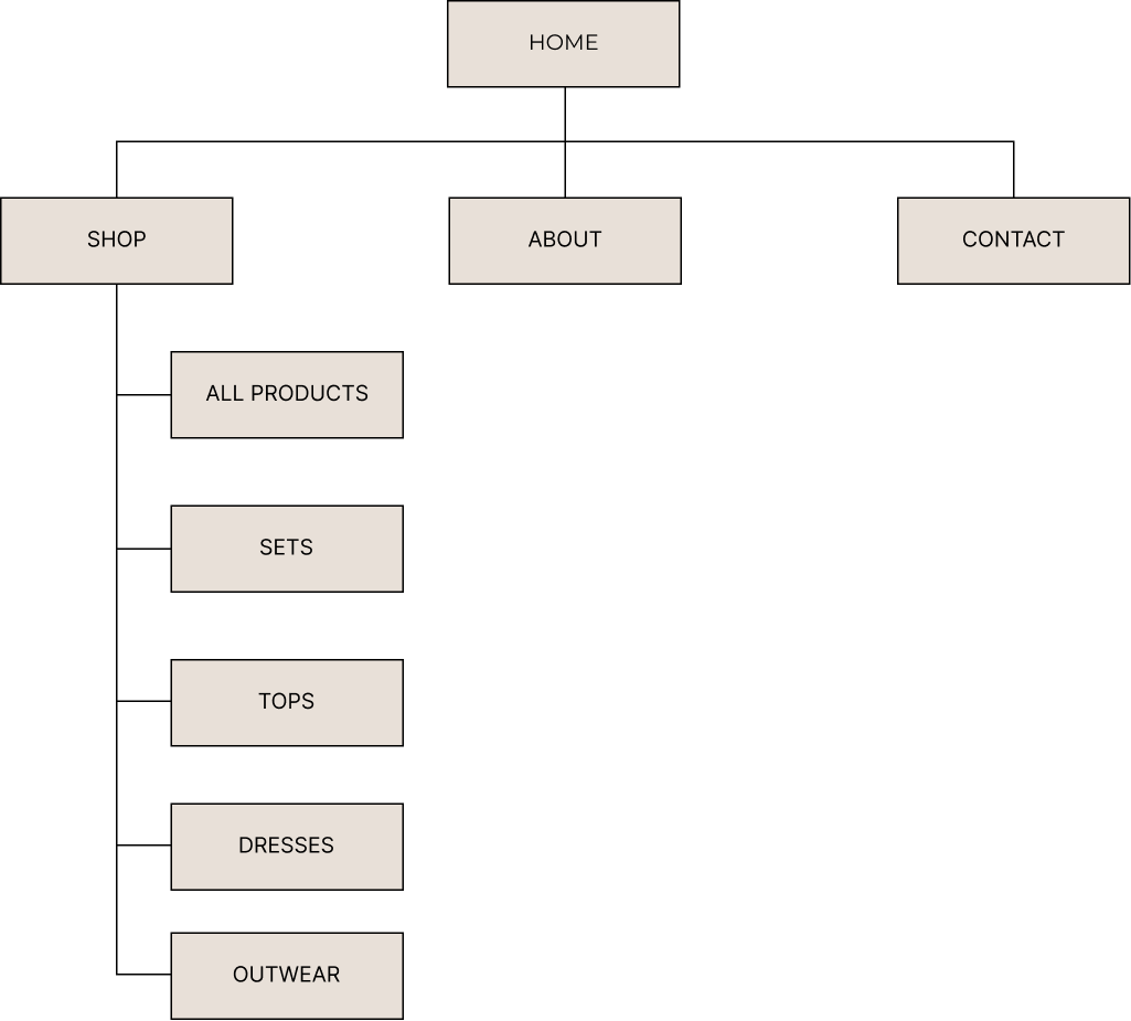
In UX/UI design, a visual sitemap is a graphical representation
or diagram that illustrates the structure and hierarchy of a website’s pages, typically displayed in a hierarchical tree-like format. It helps designers and stakeholders visualize the organization and relationships between different pages or sections of a website.

© 2023 Teodora Perieteanu. All Rights Reserved.