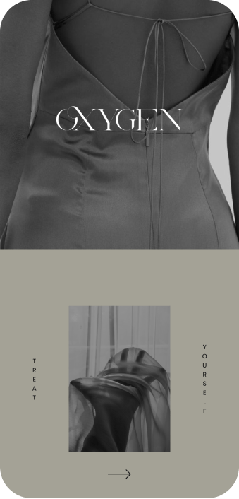
The UX/UI design of Oxygen, an app and responsive website, is centered around providing a seamless and enjoyable experience for women who seek luxurious and personalized silk dresses that reflect their self-expression and appreciation for quality craftsmanship.
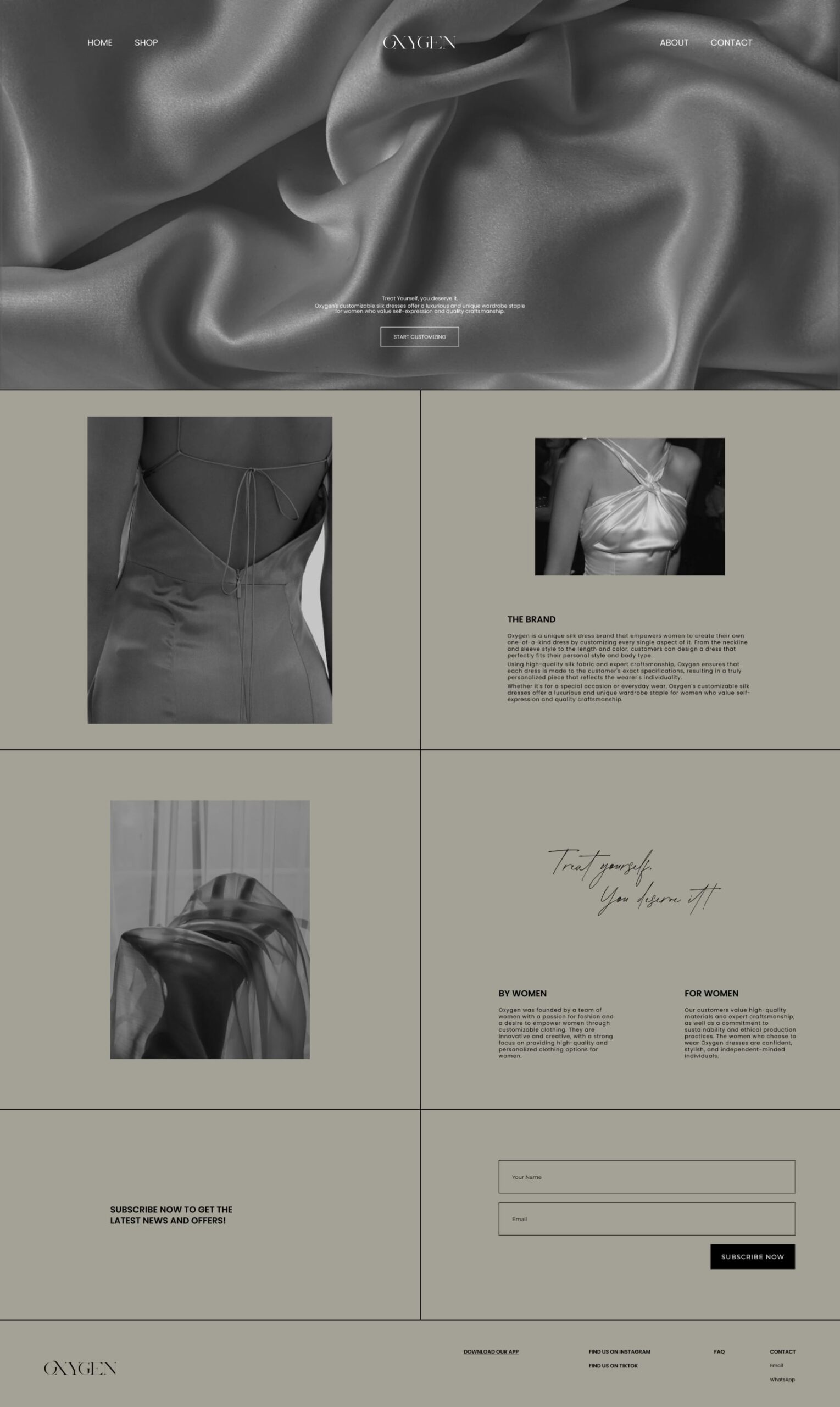
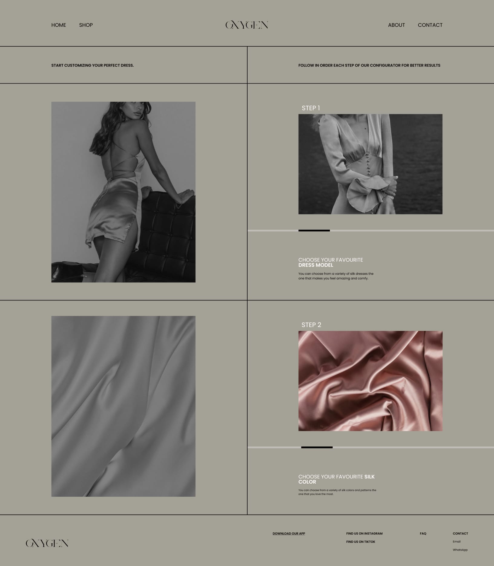

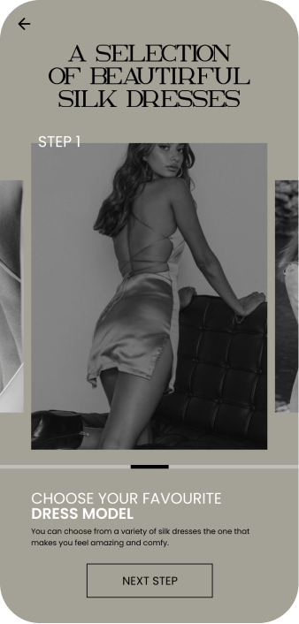
Clear, user-friendly, and visually appealing. Providing quick access to essential information, and enhancing the user experience.

With a simple and user-friendly design, you can effortlessly sign up for the newsletter.

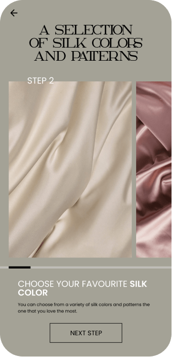
Easy customization silk dress process empowers women to express their individuality and style preferences. With interactive previews, detailed measurements, and a wide range of options, customers can create a one-of-a-kind silk dress that fits them perfectly and reflects their personal fashion taste.
The showcase of dresses features high-resolution images that highlight the exquisite details, luxurious textures, and vibrant colors of the silk fabric.

The typography is legible, ensuring clear communication of information and enhancing user readability.

on creating a seamless and delightful user experience that enhances the museum visit and audio storytelling process. By combining a user-centered approach with a visually appealing and modern design language, the UX/UI designer can create a successful Musée d’Art 60 app that offers a seamless and immersive museum visit experience for users.

As a UX/UI designer working on OXYGEN, my ROLE
revolves around creating a seamless and visually appealing experience for users interacting with the app and responsive website. MY primary focus is to enhance user satisfaction and engagement, ensuring that the platform meets the needs and expectations of women seeking customizable silk dresses.
THE PRODUCT: Oxygen is a customizable silk dress platform that offers women a luxurious and personalized shopping experience.
THE PROBLEM: Luxurious and personalized options for women seeking high-quality dresses.
THE GOAL: Empower women to express their unique style by customising their silk dresses.
My Role: Generalist Designer
RESPONSABILITIES: User research, Wireframing, Prototyping, Visual Design
Colors play a significant role in UX/UI design and can evoke different emotions, set a particular mood, and communicate information effectively.
(01) FFFFFF: White is an adaptable color that complements a wide range of other colors. It allows for flexibility in incorporating brand colors and accent hues, making it easy to adjust the color scheme without sacrificing the minimalist and clean feel of the website and app.
(02) A4A296: The grayish-green tone can convey a sense of nature, tranquility, and calmness. It aligns well with a minimalist aesthetic, creating a serene and balanced atmosphere for the fashion products showcased on the website and app.
(03) 000000: Black is an excellent choice for typography and essential text elements. Its high contrast against lighter backgrounds ensures legibility and readability, ensuring that users can easily consume the content without any visual distractions.
(01) FFFFFF
(02) A4A296
(03) 000000
Typography in UX/UI design is a powerful tool for enhancing
readability, establishing hierarchy, conveying brand identity, setting the tone and mood, promoting accessibility, and maintaining visual consistency. It plays a significant role in creating a positive user experience and facilitating effective communication between the product and its users.
Poppins is a versatile and elegant sans-serif font that offers excellent readability in various sizes. Its rounded edges and balanced proportions give it a friendly and approachable appearance. Poppins is used for body text, menus, and other longer passages of content in the Musée d’art 60 interface. This font choice ensures clear and legible text, enhancing the overall user experience and facilitating smooth reading.

Akros serves as the complementary serif font in the OXYGEN platform. With its timeless and sophisticated appearance, it adds a touch of refinement to special sections like brand taglines, headings, or specific call-to-action areas.

To add a touch of uniqueness and femininity, Abramo Script is used for delicate elements like special offers, personalized greetings, or the brand’s signature. This font choice enhances the overall luxurious and tailored feel of the website and app.
CTA buttons serve as a vital tool for guiding users and driving conversions on a website. By ensuring clarity, visual contrast, proper sizing and placement, responsiveness, engaging design, and continuous optimization, CTA buttons can effectively encourage users to take desired actions and contribute to the success of a website’s goals.
Normal State: The normal state represents the default appearance of a button when it is not being interacted with. It typically has a base color, text, and any relevant icons or imagery. The normal state sets the initial visual impression of the button and should be designed to catch the user’s attention.
Hover State: The hover state is activated when a user hovers their cursor over the button. It provides visual feedback to indicate that the button is interactive and ready for interaction. This state often includes changes in color, such as a subtle color shift or highlighting effect, to give the user a visual cue that the button can be clicked.
Pushed State: The pushed state is activated when a user clicks or taps the button, visually indicating that the button has been activated or pressed. This state typically shows a visual change, such as a slight shadow or change in background color, to provide feedback that the button is being actively pressed.
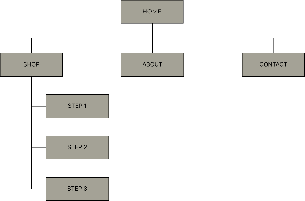
In UX/UI design, a visual sitemap is a graphical representation
or diagram that illustrates the structure and hierarchy of a website’s pages, typically displayed in a hierarchical tree-like format. It helps designers and stakeholders visualize the organization and relationships between different pages or sections of a website.
© 2023 Teodora Perieteanu. All Rights Reserved.